 鸿蒙ArkTS声明式开发:跨平台支持列表【全屏模态转场】模态转场设置
全屏模态转场
通过bindContentCover属性为组件绑定全屏模态页面,在组件插入和删除时可通过设置转场参数ModalTransition显示过渡动效。
说明:
开发前请熟悉鸿蒙开发指导文档 :[gitee.com/li-shizhen-skin/harmony-os/blob/master/README.md]
从API Version 10开始支持。后续版本如有新增内容,则采用上角标单独标记该内容的起始版本。 不支持横竖屏切换。
属性
| 名称 | 参数 | 参数描述 |
|---|---|---|
| bindContentCover | isShow: boolean, builder: [CustomBuilder], options?: [ContentCoverOptions] | 给组件绑定全屏模态页面,点击后显示模态页面。模态页面内容自定义,显示方式可设置无动画过渡,上下切换过渡以及透明渐变过渡方式。 isShow: 是否显示全屏模态页面。 从API version 10开始,该参数支持[$$]双向绑定变量 builder: 配置全屏模态页面内容。 options: 配置全屏模态页面的可选属性。 |
ContentCoverOptions
| 名称 | 类型 | 必填 | 描述 |
|---|---|---|---|
| modalTransition | [ModalTransition] | 否 | 全屏模态页面的转场方式。 |
| backgroundColor | [ResourceColor] | 否 | 全屏模态页面的背板颜色。 |
| onAppear | () => void | 否 | 全屏模态页面显示回调函数。 |
| onDisappear | () => void | 否 | 全屏模态页面回退回调函数。 |
示例
示例1
全屏模态无动画转场模式下,自定义转场动画。
// xxx.ets
@Entry
@Component
struct ModalTransitionExample {
  @State isShow:boolean = false
  @State isShow2:boolean = false

  @Builder myBuilder2() {
    Column() {
      Button("close modal 2")
        .margin(10)
        .fontSize(20)
        .onClick(()= >{
          this.isShow2 = false;
        })
    }
    .width('100%')
    .height('100%')
  }

  @Builder myBuilder() {
    Column() {
      Button("transition modal 2")
        .margin(10)
        .fontSize(20)
        .onClick(()= >{
          this.isShow2 = true;
        }).bindContentCover($$this.isShow2, this.myBuilder2(), {modalTransition: ModalTransition.NONE, backgroundColor: Color.Orange, onAppear: () = > {console.log("BindContentCover onAppear.")}, onDisappear: () = > {console.log("BindContentCover onDisappear.")}})

      Button("close modal 1")
        .margin(10)
        .fontSize(20)
        .onClick(()= >{
          this.isShow = false;
        })
    }
    .width('100%')
    .height('100%')
    .justifyContent(FlexAlign.Center)
  }

  build() {
    Column() {
      Button("transition modal 1")
        .onClick(() = > {
          this.isShow = true
        })
        .fontSize(20)
        .margin(10)
        .bindContentCover($$this.isShow, this.myBuilder(), {modalTransition: ModalTransition.NONE, backgroundColor: Color.Pink, onAppear: () = > {console.log("BindContentCover onAppear.")}, onDisappear: () = > {console.log("BindContentCover onDisappear.")}})
    }
    .justifyContent(FlexAlign.Center)
    .backgroundColor("#ff49c8ab")
    .width('100%')
    .height('100%')
  }
}

示例2
全屏模态无动画转场模式下,自定义转场动画。
// xxx.ets
import curves from '@ohos.curves';
@Entry
@Component
struct ModalTransitionExample {
  @State  @Watch("isShow1Change") isShow:boolean = false
  @State  @Watch("isShow2Change") isShow2:boolean = false
  @State isScale1:number = 1;
  @State isScale2:number = 1;
  @State flag: boolean = true
  @State show: string = 'show'

  isShow1Change() {
    this.isShow ? this.isScale1 = 0.95 : this.isScale1 = 1
  }
  isShow2Change() {
    this.isShow2 ? this.isScale2 = 0.95 : this.isScale2 = 1
  }
  @Builder myBuilder2() {
    Column() {
      Button("close modal 2")
        .margin(10)
        .fontSize(20)
        .onClick(()= >{
          this.isShow2 = false;
        })
    }
    .width('100%')
    .height('100%')
  }


  @Builder myBuilder() {
    Column() {
      Button("transition modal 2")
        .margin(10)
        .fontSize(20)
        .onClick(()= >{
          this.isShow2 = true;
        }).bindContentCover($$this.isShow2, this.myBuilder2(), {modalTransition: ModalTransition.NONE, backgroundColor: Color.Orange, onAppear: () = > {console.log("BindContentCover onAppear.")}, onDisappear: () = > {console.log("BindContentCover onDisappear.")}})

      Button("close modal 1")
        .margin(10)
        .fontSize(20)
        .onClick(()= >{
          this.isShow = false;
        })
    }
    .width('100%')
    .height('100%')
    .justifyContent(FlexAlign.Center)
    .scale({x: this.isScale2, y: this.isScale2})
    .animation({curve:curves.springMotion()})
  }

  build() {
    Column() {
      Button("transition modal 1")
        .onClick(() = > {
          this.isShow = true
        })
        .fontSize(20)
        .margin(10)
        .bindContentCover($$this.isShow, this.myBuilder(), {modalTransition: ModalTransition.NONE, backgroundColor: Color.Pink, onAppear: () = > {console.log("BindContentCover onAppear.")}, onDisappear: () = > {console.log("BindContentCover onDisappear.")}})
    }
    .justifyContent(FlexAlign.Center)
    .backgroundColor("#ff49c8ab")
    .width('100%')
    .height('100%')
    .scale({ x: this.isScale1, y: this.isScale1 })
    .animation({ curve: curves.springMotion() })
  }
}

示例3
全屏模态上下切换转场。
// xxx.ets
@Entry
@Component
struct ModalTransitionExample {
  @State isShow:boolean = false
  @State isShow2:boolean = false

  @Builder myBuilder2() {
    Column() {
      Button("close modal 2")
        .margin(10)
        .fontSize(20)
        .onClick(()= >{
          this.isShow2 = false;
        })
    }
    .width('100%')
    .height('100%')
  }

  @Builder myBuilder() {
    Column() {
      Button("transition modal 2")
        .margin(10)
        .fontSize(20)
        .onClick(()= >{
          this.isShow2 = true;
        }).bindContentCover(this.isShow2, this.myBuilder2(), {modalTransition: ModalTransition.DEFAULT, backgroundColor: Color.Gray, onAppear: () = > {console.log("BindContentCover onAppear.")}, onDisappear: () = > {console.log("BindContentCover onDisappear.")}})

      Button("close modal 1")
        .margin(10)
        .fontSize(20)
        .onClick(()= >{
          this.isShow = false;
        })
    }
    .width('100%')
    .height('100%')
    .justifyContent(FlexAlign.Center)
  }

  build() {
    Column() {
      Button("transition modal 1")
        .onClick(() = > {
          this.isShow = true
        })
        .fontSize(20)
        .margin(10)
        .bindContentCover($$this.isShow, this.myBuilder(), {modalTransition: ModalTransition.DEFAULT, backgroundColor: Color.Pink, onAppear: () = > {console.log("BindContentCover onAppear.")}, onDisappear: () = > {console.log("BindContentCover onDisappear.")}})
    }
    .justifyContent(FlexAlign.Center)
    .backgroundColor(Color.White)
    .width('100%')
    .height('100%')
  }
}

示例4
全屏模态透明度渐变转场。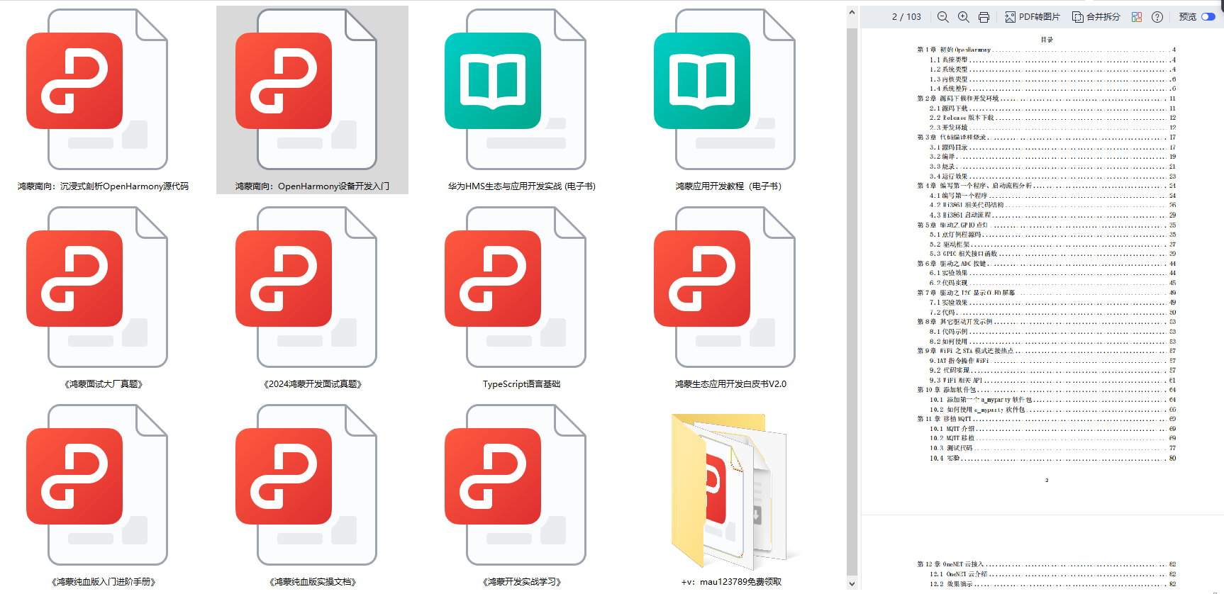
`HarmonyOS与OpenHarmony鸿蒙文档籽料:mau123789是v直接拿`
// xxx.ets
@Entry
@Component
struct ModalTransitionExample {
  @State isShow:boolean = false
  @State isShow2:boolean = false

  @Builder myBuilder2() {
    Column() {
      Button("close modal 2")
        .margin(10)
        .fontSize(20)
        .onClick(()= >{
          this.isShow2 = false;
        })
    }
    .width('100%')
    .height('100%')
    .justifyContent(FlexAlign.Center)
  }


  @Builder myBuilder() {
    Column() {
      Button("transition modal 2")
        .margin(10)
        .fontSize(20)
        .onClick(()= >{
          this.isShow2 = true;
        }).bindContentCover(this.isShow2, this.myBuilder2(), {modalTransition: ModalTransition.ALPHA, backgroundColor: Color.Gray, onAppear: () = > {console.log("BindContentCover onAppear.")}, onDisappear: () = > {console.log("BindContentCover onDisappear.")}})

      Button("close modal 1")
        .margin(10)
        .fontSize(20)
        .onClick(()= >{
          this.isShow = false;
        })
    }
    .width('100%')
    .height('100%')
    .justifyContent(FlexAlign.Center)
  }

  build() {
    Column() {
      Button("transition modal 1")
        .onClick(() = > {
          this.isShow = true
        })
        .fontSize(20)
        .margin(10)
        .bindContentCover($$this.isShow, this.myBuilder(), {modalTransition: ModalTransition.ALPHA, backgroundColor: Color.Pink, onAppear: () = > {console.log("BindContentCover onAppear.")}, onDisappear: () = > {console.log("BindContentCover onDisappear.")}})
    }
    .justifyContent(FlexAlign.Center)
    .backgroundColor(Color.White)
    .width('100%')
    .height('100%')
  }
}

审核编辑 黄宇
声明:本文内容及配图由入驻作者撰写或者入驻合作网站授权转载。文章观点仅代表作者本人,不代表电子发烧友网立场。文章及其配图仅供工程师学习之用,如有内容侵权或者其他违规问题,请联系本站处理。
举报投诉
-
模态
+关注
关注
0文章
9浏览量
6284 -
鸿蒙
+关注
关注
57文章
2398浏览量
43133
发布评论请先 登录
相关推荐

OpenHarmony实战开发-如何实现模态转场
实现。
使用bindContentCover构建全屏模态转场效果
bindContentCover接口用于为组件绑定全屏模态页面,在组件出现
发表于 04-28 14:47
模态窗口的设置问题
Labview中,一个窗口如果设置为模态窗口,则打开后,点击其他窗口应该是没有作用的。我设置的几个子VI为模态窗口,效果都没有问题。但有一个子VI,
发表于 11-28 21:56
【木棉花】ArkUI转场动画的使用——学习笔记
建名为Item的子组件,声明子组件Item的UI布局并添加样式。创建Stack组件,包含图片和文本,然后添加文本信息和页面跳转事件,定义变量text和uri。其中text用于给Text组件设置文本信息
发表于 12-19 18:00
HarmonyOS应用开发-ACE 2.0转场动画体验
一、组件说明展现了ACE 2.0转场动画的使用。其中包含页面间转场、组件内转场以及共享元素转场。二、效果图三、完整代码地址https://gitee.com/jltfcloudcn/j
发表于 08-23 10:30
Harmony/OpenHarmony应用开发-转场动画组件内转场
跟随animateTo中的配置)。说明: 从API Version 7开始支持。开发语言ets.属性:名称参数类型参数描述transitionTransitionOptions所有参数均为可选参数
发表于 12-28 16:19
HarmonyOS/OpenHarmony应用开发-转场动画共享元素转场
设置页面间转场时共享元素的转场动效。说明: 从API Version 7开始支持。开发语言ets.示例代码
发表于 01-04 17:22
鸿蒙ArkTS声明式开发:跨平台支持列表【按键事件】
按键事件指组件与键盘、遥控器等按键设备交互时触发的事件,适用于所有可获焦组件,例如Button。对于Text,Image等默认不可获焦的组件,可以设置focusable属性为true后使用按键事件。

鸿蒙ArkTS声明式开发:跨平台支持列表【显隐控制】 通用属性
控制当前组件显示或隐藏。注意,即使组件处于隐藏状态,在页面刷新时仍存在重新创建过程,因此当对性能有严格要求时建议使用[条件渲染]代替。 默认值:Visibility.Visible 从API version 9开始,该接口支持在ArkTS卡片中使用。
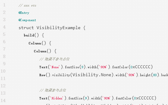
鸿蒙ArkTS声明式开发:跨平台支持列表【形状裁剪】 通用属性
参数为相应类型的组件,按指定的形状对当前组件进行裁剪;参数为boolean类型时,设置是否按照父容器边缘轮廓进行裁剪。 默认值:false 从API version 9开始,该接口支持在ArkTS卡片中使用。
鸿蒙ArkTS声明式开发:跨平台支持列表【菜单控制】 通用属性
为组件绑定弹出式菜单,弹出式菜单以垂直列表形式显示菜单项,可通过长按、点击或鼠标右键触发。

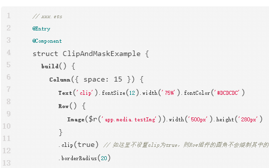
鸿蒙ArkTS声明式开发:跨平台支持列表【多态样式】 通用属性
设置组件不同状态的样式。 从API version 9开始,该接口支持在ArkTS卡片中使用。
鸿蒙ArkTS声明式开发:跨平台支持列表【半模态转场】模态转场设置
通过bindSheet属性为组件绑定半模态页面,在组件插入时可通过设置自定义或默认的内置高度确定半模态大小。


 工商网监
工商网监
评论