 鸿蒙ArkTS声明式组件:Text
Text
显示一段文本的组件。
说明:
开发前请熟悉鸿蒙开发指导文档 :[gitee.com/li-shizhen-skin/harmony-os/blob/master/README.md]
该组件从API Version 7开始支持。后续版本如有新增内容,则采用上角标单独标记该内容的起始版本。
子组件
可以包含[Span]和[ImageSpan]子组件。
接口
Text(content?: string | Resource)
从API version 9开始,该接口支持在ArkTS卡片中使用。
参数:
| 参数名 | 参数类型 | 必填 | 参数描述 |
|---|---|---|---|
| content | string | [Resource] | 否 |
属性
除支持[通用属性]和[文本通用属性]外,还支持以下属性:
| 名称 | 参数类型 | 描述 |
|---|---|---|
| textAlign | [TextAlign] | 设置文本段落在水平方向的对齐方式。 默认值:TextAlign.Start 说明: 文本段落宽度占满Text组件宽度;可通过[align]属性控制文本段落在垂直方向上的位置,此组件中不可通过align属性控制文本段落在水平方向上的位置,即align属性中Alignment.TopStart、Alignment.Top、Alignment.TopEnd效果相同,控制内容在顶部,Alignment.Start、Alignment.Center、Alignment.End效果相同,控制内容垂直居中,Alignment.BottomStart、Alignment.Bottom、Alignment.BottomEnd效果相同,控制内容在底部。结合TextAlign属性可控制内容在水平方向的位置。 从API version 9开始,该接口支持在ArkTS卡片中使用。 |
| textOverflow | {overflow: [TextOverflow]} | 设置文本超长时的显示方式。 默认值:{overflow: TextOverflow.Clip}**说明:**文本截断是按字截断。例如,英文以单词为最小单位进行截断,若需要以字母为单位进行截断,可在字母间添加零宽空格:u200B。 当overflow设置为TextOverflow.None、TextOverflow.Clip、TextOverflow.Ellipsis时,需配合maxLines使用,单独设置不生效。设置TextOverflow.None与TextOverflow.Clip效果一样。当overflow设置为TextOverflow.Marquee时,文本在一行内滚动显示,设置maxLines及copyOption属性均不生效。 从API version 9开始,该接口支持在ArkTS卡片中使用。 |
| maxLines | number | 设置文本的最大行数。 默认值:Infinity**说明:**默认情况下,文本是自动折行的,如果指定此参数,则文本最多不会超过指定的行。如果有多余的文本,可以通过textOverflow来指定截断方式。 从API version 9开始,该接口支持在ArkTS卡片中使用。 |
| lineHeight | string | number |
| decoration | { type: [TextDecorationType], color?: [ResourceColor] } | 设置文本装饰线样式及其颜色。 默认值:{ type: TextDecorationType.None, color:Color.Black } 从API version 9开始,该接口支持在ArkTS卡片中使用。 |
| baselineOffset | number | string |
| letterSpacing | number | string |
| minFontSize | number | string |
| maxFontSize | number | string |
| textCase | [TextCase] | 设置文本大小写。 默认值:TextCase.Normal 从API version 9开始,该接口支持在ArkTS卡片中使用。 |
| copyOption9+ | [CopyOptions] | 组件支持设置文本是否可复制粘贴。 默认值:CopyOptions.None 该接口支持在ArkTS卡片中使用。**说明:**设置copyOptions为CopyOptions.InApp或者CopyOptions.LocalDevice,长按文本,会弹出文本选择菜单,可选中文本并进行复制、全选操作。 |
| textShadow10+ | [ShadowOptions] | 设置文字阴影效果。 |
| heightAdaptivePolicy10+ | [TextHeightAdaptivePolicy] | 设置文本自适应高度的方式。 默认值:TextHeightAdaptivePolicy.MAX_LINES_FIRST。**说明:**当设置为TextHeightAdaptivePolicy.MAX_LINES_FIRST时,优先使用maxLines属性来调整文本高度。如果使用maxLines属性的布局大小超过了布局约束,则尝试在minFontSize和maxFontSize的范围内缩小字体以显示更多文本。 当设置为TextHeightAdaptivePolicy.MIN_FONT_SIZE_FIRST时,优先使用minFontSize属性来调整文本高度。如果使用minFontSize属性可以将文本布局在一行中,则尝试在minFontSize和maxFontSize的范围内增大字体并使用最大可能的字体大小。 当设置为TextHeightAdaptivePolicy.LAYOUT_CONSTRAINT_FIRST时,优先使用布局约束来调整文本高度。如果布局大小超过布局约束,则尝试在minFontSize和maxFontSize的范围内缩小字体以满足布局约束。如果将字体大小缩小到minFontSize后,布局大小仍然超过布局约束,则删除超过布局约束的行。 |
| textIndent10+ | number | string |
| font10+ | [Font] | 设置文本样式。包括字体大小、字体粗细、字体族和字体风格。 |
说明:
HarmonyOS与OpenHarmony鸿蒙文档籽料:mau123789是v直接拿不支持Text内同时存在文本内容和Span或ImageSpan子组件。如果同时存在,只显示Span或ImageSpan内的内容。
通用属性中形状裁剪[clip]属性,在Text默认值为true。
事件
支持[通用事件]
示例
示例1
// xxx.ets
@Entry
@Component
struct TextExample1 {
  build() {
    Flex({ direction: FlexDirection.Column, alignItems: ItemAlign.Start, justifyContent: FlexAlign.SpaceBetween }) {
      // 文本水平方向对齐方式设置
      // 单行文本
      Text('textAlign').fontSize(9).fontColor(0xCCCCCC)
      Text('TextAlign set to Center.')
        .textAlign(TextAlign.Center)
        .fontSize(12)
        .border({ width: 1 })
        .padding(10)
        .width('100%')
      Text('TextAlign set to Start.')
        .textAlign(TextAlign.Start)
        .fontSize(12)
        .border({ width: 1 })
        .padding(10)
        .width('100%')
      Text('TextAlign set to End.')
        .textAlign(TextAlign.End)
        .fontSize(12)
        .border({ width: 1 })
        .padding(10)
        .width('100%')

      // 多行文本
      Text('This is the text content with textAlign set to Center.')
        .textAlign(TextAlign.Center)
        .fontSize(12)
        .border({ width: 1 })
        .padding(10)
        .width('100%')
      Text('This is the text content with textAlign set to Start.')
        .textAlign(TextAlign.Start)
        .fontSize(12)
        .border({ width: 1 })
        .padding(10)
        .width('100%')
      Text('This is the text content with textAlign set to End.')
        .textAlign(TextAlign.End)
        .fontSize(12)
        .border({ width: 1 })
        .padding(10)
        .width('100%')


      // 文本超长时显示方式
      Text('TextOverflow+maxLines').fontSize(9).fontColor(0xCCCCCC)
      // 超出maxLines截断内容展示
      Text('This is the setting of textOverflow to Clip text content This is the setting of textOverflow to None text content. This is the setting of textOverflow to Clip text content This is the setting of textOverflow to None text content.')
        .textOverflow({ overflow: TextOverflow.Clip })
        .maxLines(1)
        .fontSize(12)
        .border({ width: 1 })
        .padding(10)

      // 超出maxLines展示省略号
      Text('This is set textOverflow to Ellipsis text content This is set textOverflow to Ellipsis text content.'.split('')
        .join('u200B'))
        .textOverflow({ overflow: TextOverflow.Ellipsis })
        .maxLines(1)
        .fontSize(12)
        .border({ width: 1 })
        .padding(10)

      Text('lineHeight').fontSize(9).fontColor(0xCCCCCC)
      Text('This is the text with the line height set. This is the text with the line height set.')
        .fontSize(12).border({ width: 1 }).padding(10)
      Text('This is the text with the line height set. This is the text with the line height set.')
        .fontSize(12).border({ width: 1 }).padding(10)
        .lineHeight(20)
    }.height(600).width(350).padding({ left: 35, right: 35, top: 35 })
  }
}

示例2
@Entry
@Component
struct TextExample2 {
  build() {
    Flex({ direction: FlexDirection.Column, alignItems: ItemAlign.Start, justifyContent: FlexAlign.SpaceBetween }) {
      Text('decoration').fontSize(9).fontColor(0xCCCCCC)
      Text('This is the text content with the decoration set to LineThrough and the color set to Red.')
        .decoration({
          type: TextDecorationType.LineThrough,
          color: Color.Red
        })
        .fontSize(12)
        .border({ width: 1 })
        .padding(10)
        .width('100%')


      Text('This is the text content with the decoration set to Overline and the color set to Red.')
        .decoration({
          type: TextDecorationType.Overline,
          color: Color.Red
        })
        .fontSize(12)
        .border({ width: 1 })
        .padding(10)
        .width('100%')


      Text('This is the text content with the decoration set to Underline and the color set to Red.')
        .decoration({
          type: TextDecorationType.Underline,
          color: Color.Red
        })
        .fontSize(12)
        .border({ width: 1 })
        .padding(10)
        .width('100%')

      // 文本基线偏移
      Text('baselineOffset').fontSize(9).fontColor(0xCCCCCC)
      Text('This is the text content with baselineOffset 0.')
        .baselineOffset(0)
        .fontSize(12)
        .border({ width: 1 })
        .padding(10)
        .width('100%')
      Text('This is the text content with baselineOffset 30.')
        .baselineOffset(30)
        .fontSize(12)
        .border({ width: 1 })
        .padding(10)
        .width('100%')
      Text('This is the text content with baselineOffset -20.')
        .baselineOffset(-20)
        .fontSize(12)
        .border({ width: 1 })
        .padding(10)
        .width('100%')

      // 文本字符间距
      Text('letterSpacing').fontSize(9).fontColor(0xCCCCCC)
      Text('This is the text content with letterSpacing 0.')
        .letterSpacing(0)
        .fontSize(12)
        .border({ width: 1 })
        .padding(10)
        .width('100%')
      Text('This is the text content with letterSpacing 3.')
        .letterSpacing(3)
        .fontSize(12)
        .border({ width: 1 })
        .padding(10)
        .width('100%')
      Text('This is the text content with letterSpacing -1.')
        .letterSpacing(-1)
        .fontSize(12)
        .border({ width: 1 })
        .padding(10)
        .width('100%')

      Text('textCase').fontSize(9).fontColor(0xCCCCCC)
      Text('This is the text content with textCase set to Normal.')
        .textCase(TextCase.Normal)
        .fontSize(12)
        .border({ width: 1 })
        .padding(10)
        .width('100%')
      // 文本全小写展示
      Text('This is the text content with textCase set to LowerCase.')
        .textCase(TextCase.LowerCase)
        .fontSize(12)
        .border({ width: 1 })
        .padding(10)
        .width('100%')
      // 文本全大写展示
      Text('This is the text content with textCase set to UpperCase.')
        .textCase(TextCase.UpperCase)
        .fontSize(12).border({ width: 1 }).padding(10)

    }.height(700).width(350).padding({ left: 35, right: 35, top: 35 })
  }
}

示例3
textShadow,heightAdaptivePolicy,TextOverflow.MARQUEE使用示例:
@Entry
@Component
struct TextExample {
  build() {
    Column({ space: 8 }) {
      Text('textShadow').fontSize(9).fontColor(0xCCCCCC).margin(15).width('90%')
      // 设置文字阴影效果
      Text('textShadow')
        .width('80%')
        .height(55)
        .fontSize(40)
        .lineHeight(55)
        .textAlign(TextAlign.Center)
        .textShadow({ radius: 10, color: Color.Black, offsetX: 0, offsetY: 0 })
        .borderWidth(1)
      Divider()
      // 设置文本自适应高度的方式
      Text('heightAdaptivePolicy').fontSize(9).fontColor(0xCCCCCC).margin(15).width('90%')
      Text('This is the text with the height adaptive policy set')
        .width('80%')
        .height(90)
        .borderWidth(1)
        .minFontSize(10)
        .maxFontSize(30)
        .maxLines(3)
        .textOverflow({ overflow: TextOverflow.Ellipsis })
        .heightAdaptivePolicy(TextHeightAdaptivePolicy.MAX_LINES_FIRST)
      Text('This is the text with the height adaptive policy set')
        .width('80%')
        .height(90)
        .borderWidth(1)
        .minFontSize(10)
        .maxFontSize(30)
        .maxLines(3)
        .textOverflow({ overflow: TextOverflow.Ellipsis })
        .heightAdaptivePolicy(TextHeightAdaptivePolicy.MIN_FONT_SIZE_FIRST)
      Text('This is the text with the height adaptive policy set')
        .width('80%')
        .height(90)
        .borderWidth(1)
        .minFontSize(10)
        .maxFontSize(30)
        .maxLines(3)
        .textOverflow({ overflow: TextOverflow.Ellipsis })
        .heightAdaptivePolicy(TextHeightAdaptivePolicy.LAYOUT_CONSTRAINT_FIRST)
      Divider()
      Text('marquee').fontSize(9).fontColor(0xCCCCCC).margin(15).width('90%')
      // 设置文本超长时以跑马灯的方式展示
      Text('This is the text with the text overflow set marquee')
        .width(300)
        .borderWidth(1)
        .textOverflow({ overflow: TextOverflow.MARQUEE })
    }
  }
}

审核编辑 黄宇
声明:本文内容及配图由入驻作者撰写或者入驻合作网站授权转载。文章观点仅代表作者本人,不代表电子发烧友网立场。文章及其配图仅供工程师学习之用,如有内容侵权或者其他违规问题,请联系本站处理。
举报投诉
-
组件
+关注
关注
1文章
520浏览量
17964 -
鸿蒙
+关注
关注
57文章
2398浏览量
43133
发布评论请先 登录
相关推荐
了解鸿蒙OS Text组件
文本(Text)是用来显示字符串的组件,在界面上显示为一块文本区域。Text 作为一个基本组件,有很多扩展,常见的有按钮组件 Button,
鸿蒙ArkTS的起源和简介
1、引言
Mozilla创造了JS,Microsoft创建了TS,Huawei进一步推出了ArkTS。
从最初的基础的逻辑交互能力,到具备类型系统的高效工程开发能力,再到融合声明式UI、多维状态管理
发表于 01-16 16:23
HarmonyOS/OpenHarmony应用开发-ArkTS的声明式开发范式
轨迹。状态与数据管理状态数据管理作为基于ArkTS的声明式开发范式的特色,通过功能不同的装饰器给开发者提供了清晰的页面更新渲染流程和管道。状态管理包括UI组件状态和应用程序状态,两者协
发表于 01-17 15:09
HarmonyOS/OpenHarmony应用开发-ArkTS语言声明式UI描述
ArkTS以声明方式组合和扩展组件来描述应用程序的UI,同时还提供了基本的属性、事件和子组件配置方法,帮助开发者实现应用交互逻辑。
一、创建组件
发表于 06-05 15:26
HarmonyOS/OpenHarmony原生应用-ArkTS万能卡片组件Text
显示一段文本的组件。该组件从API Version 7开始支持。用上角标单独标记该内容的起始版本。可以包含Span子组件。
一、接口
Text(content?: string | R
发表于 10-19 15:13
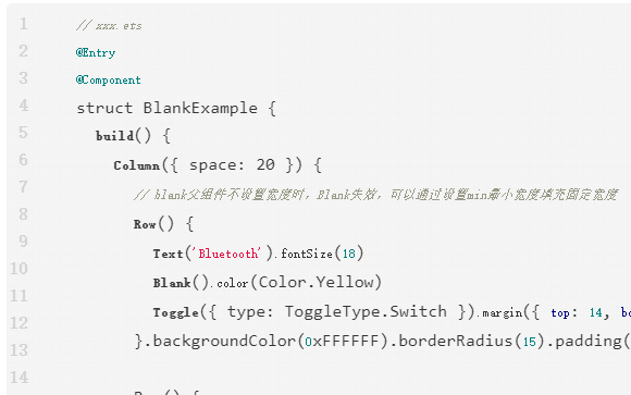
鸿蒙ArkTS声明式组件:Blank
空白填充组件,在容器主轴方向上,空白填充组件具有自动填充容器空余部分的能力。仅当父组件为Row/Column/Flex时生效。


 工商网监
工商网监
评论