 鸿蒙ArkTS声明式组件:TextPicker
TextPicker
滑动选择文本内容的组件。
说明:
开发前请熟悉鸿蒙开发指导文档 :[gitee.com/li-shizhen-skin/harmony-os/blob/master/README.md]
该组件从API Version 8开始支持。后续版本如有新增内容,则采用上角标单独标记该内容的起始版本。
子组件
无
接口
TextPicker(options?: {range: string[] | string[][] | Resource | TextPickerRangeContent[] | TextCascadePickerRangeContent[], selected?: number, value?: string})
根据range指定的选择范围创建文本选择器。
参数:
| 参数名 | 参数类型 | 必填 | 参数描述 |
|---|---|---|---|
| range | string[] | string[][]10+ | [Resource] |
| selected | number | number[]10+ | 否 |
| value | string | string[]10+ | 否 |
TextPickerRangeContent10+类型说明
| 参数名 | 参数类型 | 必填 | 参数描述 |
|---|---|---|---|
| icon | string | [Resource] | 是 |
| text | string | [Resource] | 否 |
TextCascadePickerRangeContent10+类型说明
| 参数名 | 参数类型 | 必填 | 参数描述 |
|---|---|---|---|
| text | string | [Resource] | 是 |
| children | [TextCascadePickerRangeContent][] | 否 | 联动数据。 |
属性
除支持[通用属性]外,还支持以下属性:
| 名称 | 参数类型 | 描述 |
|---|---|---|
| defaultPickerItemHeight | number | string |
| disappearTextStyle10+ | [PickerTextStyle] | 设置所有选项中最上和最下两个选项的文本颜色、字号、字体粗细。 默认值: { color: '#ff182431', font: { size: '14fp', weight: FontWeight.Regular } } |
| textStyle10+ | [PickerTextStyle] | 设置所有选项中除了最上、最下及选中项以外的文本颜色、字号、字体粗细。 默认值: { color: '#ff182431', font: { size: '16fp', weight: FontWeight.Regular } } |
| selectedTextStyle10+ | [PickerTextStyle] | 设置选中项的文本颜色、字号、字体粗细。 默认值: { color: '#ff007dff', font: { size: '20vp', weight: FontWeight.Medium } } |
| selectedIndex10+ | number | number[] |
| canLoop10+ | boolean | 设置是否可循环滚动,true:可循环,false:不可循环,默认值:true。 |
事件
除支持[通用事件]外,还支持以下事件:
| 名称 | 描述 |
|---|---|
| onChange(callback: (value: string | string[]10+, index: number |
HarmonyOS与OpenHarmony鸿蒙文档籽料:mau123789是v直接拿 |
示例
示例1
// xxx.ets
class bottom {
  bottom:number = 50
}
let bott:bottom = new bottom()
@Entry
@Component
struct TextPickerExample {
  private select: number = 1
  private apfruits: string[] = ['apple1', 'apple2', 'apple3', 'apple4']
  private orfruits: string[] = ['orange1', 'orange2', 'orange3', 'orange4']
  private pefruits: string[] = ['peach1', 'peach2', 'peach3', 'peach4']
  private multi: string[][] = [this.apfruits, this.orfruits, this.pefruits]
  private cascade: TextCascadePickerRangeContent[] = [
    {
      text: '辽宁省',
      children: [{ text: '沈阳市', children: [{ text: '沈河区' }, { text: '和平区' }, { text: '浑南区' }] },
        { text: '大连市', children: [{ text: '中山区' }, { text: '金州区' }, { text: '长海县' }] }]
    },
    {
      text: '吉林省',
      children: [{ text: '长春市', children: [{ text: '南关区' }, { text: '宽城区' }, { text: '朝阳区' }] },
        { text: '四平市', children: [{ text: '铁西区' }, { text: '铁东区' }, { text: '梨树县' }] }]
    },
    {
      text: '黑龙江省',
      children: [{ text: '哈尔滨市', children: [{ text: '道里区' }, { text: '道外区' }, { text: '南岗区' }] },
        { text: '牡丹江市', children: [{ text: '东安区' }, { text: '西安区' }, { text: '爱民区' }] }]
    }
  ]

  build() {
    Column() {

      TextPicker({ range: this.apfruits, selected: this.select })
        .onChange((value: string | string[], index: number | number[]) = > {
          console.info('Picker item changed, value: ' + value + ', index: ' + index)
        }).margin(bott)

      TextPicker({ range: this.multi })
        .onChange((value: string | string[], index: number | number[]) = > {
          console.info('TextPicker 多列:onChange ' + JSON.stringify(value) + ', ' + 'index: ' + JSON.stringify(index))
        }).margin(bott)

      TextPicker({ range: this.cascade })
        .onChange((value: string | string[], index: number | number[]) = > {
          console.info('TextPicker 多列联动:onChange ' + JSON.stringify(value) + ', ' + 'index: ' + JSON.stringify(index))
        })
    }
  }
}
示例2

// xxx.ets
@Entry
@Component
struct TextPickerExample {
  private select: number = 1
  private fruits: string[] = ['apple1', 'orange2', 'peach3', 'grape4']

  build() {
    Column() {
      TextPicker({ range: this.fruits, selected: this.select })
        .onChange((value: string | string[], index: number | number[]) = > {
          console.info('Picker item changed, value: ' + value + ', index: ' + index)
        })
        .disappearTextStyle({color: Color.Red, font: {size: 15, weight: FontWeight.Lighter}})
        .textStyle({color: Color.Black, font: {size: 20, weight: FontWeight.Normal}})
        .selectedTextStyle({color: Color.Blue, font: {size: 30, weight: FontWeight.Bolder}})
    }.width('100%').height('100%')
  }
}

审核编辑 黄宇
声明:本文内容及配图由入驻作者撰写或者入驻合作网站授权转载。文章观点仅代表作者本人,不代表电子发烧友网立场。文章及其配图仅供工程师学习之用,如有内容侵权或者其他违规问题,请联系本站处理。
举报投诉
-
组件
+关注
关注
1文章
512浏览量
17822 -
鸿蒙
+关注
关注
57文章
2351浏览量
42847
发布评论请先 登录
相关推荐
HarmonyOS/OpenHarmony应用开发-ArkTS的声明式开发范式
轨迹。状态与数据管理状态数据管理作为基于ArkTS的声明式开发范式的特色,通过功能不同的装饰器给开发者提供了清晰的页面更新渲染流程和管道。状态管理包括UI组件状态和应用程序状态,两者协
发表于 01-17 15:09
HarmonyOS/OpenHarmony应用开发-声明式开发范式组件汇总
组件是构建页面的核心,每个组件通过对数据和方法的简单封装,实现独立的可视、可交互功能单元。组件之间相互独立,随取随用,也可以在需求相同的地方重复使用。声明
发表于 01-19 11:14
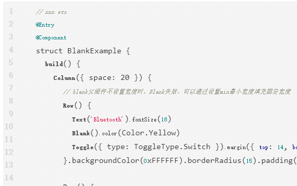
鸿蒙ArkTS声明式组件:Blank
空白填充组件,在容器主轴方向上,空白填充组件具有自动填充容器空余部分的能力。仅当父组件为Row/Column/Flex时生效。

鸿蒙ArkTS声明式组件:PatternLock
图案密码锁组件,以九宫格图案的方式输入密码,用于密码验证场景。手指在PatternLock组件区域按下时开始进入输入状态,手指离开屏幕时结束输入状态完成密码输入。


 工商网监
工商网监
评论