 鸿蒙ArkTS容器组件:ListItemGroup
ListItemGroup
该组件用来展示列表item分组,宽度默认充满[List]组件,必须配合List组件来使用。
说明:
开发前请熟悉鸿蒙开发指导文档 :[gitee.com/li-shizhen-skin/harmony-os/blob/master/README.md]
- 该组件从API Version 9开始支持。后续版本如有新增内容,则采用上角标单独标记该内容的起始版本。
- 该组件的父组件只能是[List]
使用说明
当ListItemGroup的父组件List的listDirection属性为Axis.Vertical时,不允许设置ListItemGroup组件的height属性。ListItemGroup的高度为header高度、footer高度和所有ListItem布局后总高度之和。当父组件List的listDirection属性为Axis.Horizontal时,不允许设置ListItemGroup组件的width属性。ListItemGroup的宽度为header宽度、footer宽度和所有ListItem布局后总宽度之和。
当前ListItemGroup内部的ListItem组件不支持编辑、拖拽功能,即ListItem组件的editable属性不生效。
子组件
包含[ListItem]子组件。
接口
ListItemGroup(options?: {header?: CustomBuilder, footer?: CustomBuilder, space?: number | string, style?: ListItemGroupStyle})
参数:
| 参数名 | 参数类型 | 必填 | 参数描述 |
|---|---|---|---|
| header | [CustomBuilder] | 否 | 设置ListItemGroup头部组件。 |
| footer | [CustomBuilder] | 否 | 设置ListItemGroup尾部组件。 |
| space | number | string | 否 |
| style10+ | [ListItemGroupStyle] | 否 | 设置List组件卡片样式。 默认值: ListItemGroupStyle.NONE 设置为ListItemGroupStyle.NONE时无样式。 设置为ListItemStyle.CARD时,必须配合[ListItem]的ListItemStyle.CARD同时使用,显示默认卡片样式。 卡片样式下, 为卡片内的列表选项提供了默认的focus、hover、press、selected和disable样式。**说明:**当前卡片模式下,不支持listDirection属性设置,使用默认Axis.Vertical排列方向。 当前卡片模式下,List属性alignListItem默认为ListItemAlign.Center,居中对齐显示。 当前卡片模式下,ListItemGroup不支持设置头部组件header和尾部组件footer。 若仅设置ListItemGroupStyle.CARD,未设置ListItemStyle.CARD时,只显示部分卡片样式及功能。 |
属性
| 名称 | 参数类型 | 描述 |
|---|---|---|
| divider | { strokeWidth: [Length], color?: [ResourceColor], startMargin?: [Length], endMargin?: [Length] } | null |
ListItemGroupStyle10+枚举说明
| 名称 | 描述 |
|---|---|
| NONE | 无样式。 |
| CARD | 显示默认卡片样式。 |
说明:
ListItemGroup组件不支持设置[通用属性aspectRatio]。
ListItemGroup组件如果主轴方向是垂直方向时,设置[通用属性height]属性不生效。
HarmonyOS与OpenHarmony鸿蒙文档籽料:mau123789是v直接拿
ListItemGroup组件如果主轴方向是水平方向时,设置[通用属性width]属性不生效。
示例
// xxx.ets
@Entry
@Component
struct ListItemGroupExample {
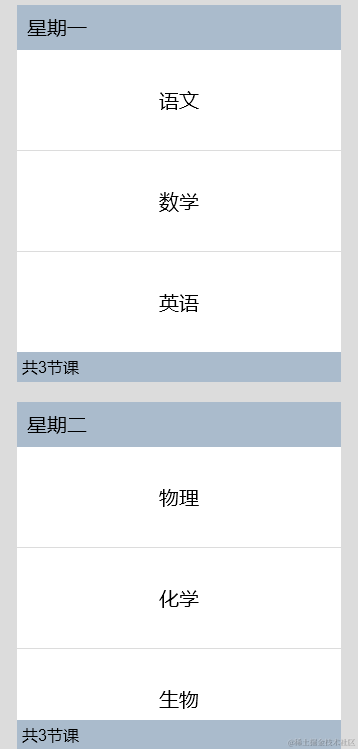
private timetable: TimeTable[] = [
{
title: '星期一',
projects: ['语文', '数学', '英语']
},
{
title: '星期二',
projects: ['物理', '化学', '生物']
},
{
title: '星期三',
projects: ['历史', '地理', '政治']
},
{
title: '星期四',
projects: ['美术', '音乐', '体育']
}
]
@Builder
itemHead(text: string) {
Text(text)
.fontSize(20)
.backgroundColor(0xAABBCC)
.width("100%")
.padding(10)
}
@Builder
itemFoot(num: number) {
Text('共' + num + "节课")
.fontSize(16)
.backgroundColor(0xAABBCC)
.width("100%")
.padding(5)
}
build() {
Column() {
List({ space: 20 }) {
ForEach(this.timetable, (item: TimeTable) = > {
ListItemGroup({ header: this.itemHead(item.title), footer: this.itemFoot(item.projects.length) }) {
ForEach(item.projects, (project: string) = > {
ListItem() {
Text(project)
.width("100%")
.height(100)
.fontSize(20)
.textAlign(TextAlign.Center)
.backgroundColor(0xFFFFFF)
}
}, (item: string) = > item)
}
.divider({ strokeWidth: 1, color: Color.Blue }) // 每行之间的分界线
})
}
.width('90%')
.sticky(StickyStyle.Header | StickyStyle.Footer)
.scrollBar(BarState.Off)
}.width('100%').height('100%').backgroundColor(0xDCDCDC).padding({ top: 5 })
}
}
interface TimeTable {
title: string;
projects: string[];
}
- 示例2
// xxx.ets
@Entry
@Component
struct ListItemGroupExample2 {
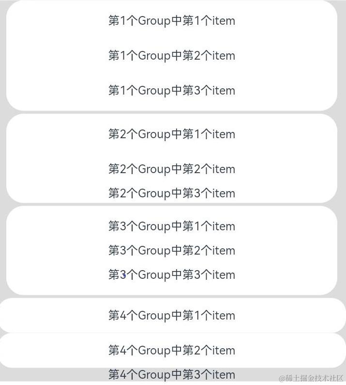
private arr: ArrObject[] = [
{
style: ListItemGroupStyle.CARD,
itemStyles: [ListItemStyle.CARD, ListItemStyle.CARD, ListItemStyle.CARD]
},
{
style: ListItemGroupStyle.CARD,
itemStyles: [ListItemStyle.CARD, ListItemStyle.CARD, ListItemStyle.NONE]
},
{
style: ListItemGroupStyle.CARD,
itemStyles: [ListItemStyle.CARD, ListItemStyle.NONE, ListItemStyle.CARD]
},
{
style: ListItemGroupStyle.NONE,
itemStyles: [ListItemStyle.CARD, ListItemStyle.CARD, ListItemStyle.NONE]
}
]
build() {
Column() {
List({ space: "4vp", initialIndex: 0 }) {
ForEach(this.arr, (item: ArrObject, index?: number) = > {
ListItemGroup({ style: item.style }) {
ForEach(item.itemStyles, (itemStyle: number, itemIndex?: number) = > {
ListItem({ style: itemStyle }) {
if (index != undefined && itemIndex != undefined) {
Text("第" + (index + 1) + "个Group中第" + (itemIndex + 1) + "个item")
.width("100%")
.textAlign(TextAlign.Center)
}
}
}, (item: string) = > item)
}
})
}
.width('100%')
.multiSelectable(true)
.backgroundColor(0xDCDCDC) // 浅蓝色的List
}
.width('100%')
.padding({ top: 5 })
}
}
interface ArrObject {
style: number;
itemStyles: number[];
}
审核编辑 黄宇
-
组件
+关注
关注
1文章
524浏览量
18103 -
鸿蒙
+关注
关注
57文章
2457浏览量
43434
发布评论请先 登录
相关推荐
鸿蒙ArkTS容器组件:SideBarContainer
鸿蒙ArkTS容器组件:WaterFlow


 工商网监
工商网监
评论