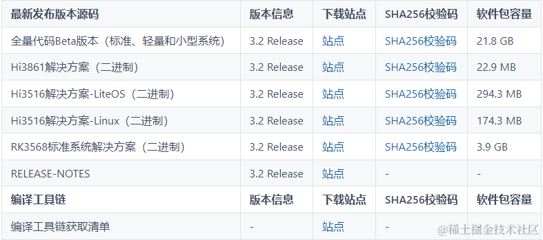
 鸿蒙ArkTS容器组件:Swiper

Swiper
滑块视图容器,提供子组件滑动轮播显示的能力。
说明:
该组件从API Version 7开始支持。后续版本如有新增内容,则采用上角标单独标记该内容的起始版本。
子组件
可以包含子组件。
说明:
开发前请熟悉鸿蒙开发指导文档 :[gitee.com/li-shizhen-skin/harmony-os/blob/master/README.md]
子组件类型:系统组件和自定义组件,支持渲染控制类型([if/else]、[ForEach]和[LazyForEach])。Swiper子组件的visibility属性设置为None,Swiper的displayMode属性设置为SwiperDisplayMode.AutoLinear或displayCount属性设置为'auto'时,对应子组件在视窗内不占位,但不影响导航点个数。
Swiper子组件的visibility属性设置为None,或者visibility属性设置为Hidden时,对应子组件不显示,但依然会在视窗内占位。
当Swiper子组件个数小于等于Swiper组件内容区内显示的节点总个数(totalDisplayCount = DisplayCount + prevMargin? (1 : 0 ) + nextMargin? (1 : 0 ))时,按照非循环模式布局处理,此时,前后边距对应子组件不显示,但依然会在视窗内占位。Swiper组件按照totalDisplayCount个数判断测算规格。
接口
Swiper(controller?: SwiperController)
参数:
| 参数名 | 参数类型 | 必填 | 参数描述 |
|---|---|---|---|
| controller | [SwiperController] | 否 | 给组件绑定一个控制器,用来控制组件翻页。 |
属性
除支持[通用属性]外,还支持以下属性,不支持[Menu控制]。
| 名称 | 参数类型 | 描述 |
|---|---|---|
| index | number | 设置当前在容器中显示的子组件的索引值。 默认值:0**说明:**设置小于0或大于等于子组件数量时,按照默认值0处理。 从API version 10开始,该属性支持[$$]双向绑定变量。 |
| autoPlay | boolean | 子组件是否自动播放。 默认值:false**说明:**loop为false时,自动轮播到最后一页时停止轮播。手势切换后不是最后一页时继续播放。 |
| interval | number | 使用自动播放时播放的时间间隔,单位为毫秒。 默认值:3000 |
| indicator10+ | [DotIndicator] | [DigitIndicator] |
| loop | boolean | 是否开启循环。 设置为true时表示开启循环,在LazyForEach懒循环加载模式下,加载的组件数量建议大于5个。 默认值:true |
| duration | number | 子组件切换的动画时长,单位为毫秒。 默认值:400 |
| vertical | boolean | 是否为纵向滑动。 默认值:false |
| itemSpace | number | string |
| displayMode | SwiperDisplayMode | 主轴方向上元素排列的模式,优先以displayCount设置的个数显示,displayCount未设置时本属性生效。 默认值:SwiperDisplayMode.STRETCH |
| cachedCount8+ | number | 设置预加载子组件个数。 默认值:1 |
| disableSwipe8+ | boolean | 禁用组件滑动切换功能。 默认值:false |
| curve8+ | [Curve] | string |
| displayCount8+ | number | string |
| effectMode8+ | [EdgeEffect] | 边缘滑动效果,loop = false时生效。 目前支持的滑动效果参见EdgeEffect的枚举说明。 默认值:EdgeEffect.Spring**说明:**控制器接口调用时不生效回弹。 |
| displayArrow10+ | value:[ArrowStyle] | boolean, isHoverShow?: boolean |
| nextMargin10+ | [Length] | 后边距,用于露出后一项的一小部分。 默认值:0**说明:**仅当SwiperDisplayMode为STRETCH模式时生效。 当主轴方向为横向布局时,nextmargin/prevmargin中任意一个大于子组件测算的宽度,nextmargin和prevmargin均不显示。 当主轴方向为纵向布局时,nextmargin/prevmargin中任意一个大于子组件测算的高度,nextmargin和prevmargin均不显示。 |
| prevMargin10+ | [Length] | 前边距,用于露出前一项的一小部分。 默认值:0**说明:**仅当SwiperDisplayMode为STRETCH模式时生效。 当主轴方向为横向布局时,nextmargin/prevmargin中任意一个大于子组件测算的宽度,prevmargin和nextmargin均不显示。 当主轴方向为纵向布局时,nextmargin/prevmargin中任意一个大于子组件测算的高度,nextmargin和prevmargin均不显示。 |
SwiperDisplayMode枚举说明
| 名称 | 描述 |
|---|---|
| STRETCH10+ | Swiper滑动一页的宽度为Swiper组件自身的宽度。 |
| AUTO_LINEAR10+ | Swiper滑动一页的宽度为视窗内最左侧子组件的宽度。 |
SwiperController
Swiper容器组件的控制器,可以将此对象绑定至Swiper组件,然后通过它控制翻页。
showNext
showNext(): void
翻至下一页。翻页带动效切换过程,时长通过duration指定。
showPrevious
showPrevious(): void
翻至上一页。翻页带动效切换过程,时长通过duration指定。
finishAnimation
finishAnimation(callback?: () => void): void
停止播放动画。
参数:
| 参数名 | 参数类型 | 必填项 | 参数描述 |
|---|---|---|---|
| callback | () => void | 否 | 动画结束的回调。 |
Indicator10+
设置导航点距离Swiper组件距离。
| 参数名 | 参数类型 | 必填项 | 参数描述 |
|---|---|---|---|
| left | [Length] | 否 | 设置导航点距离Swiper组件左边的距离。 默认值:0 单位:vp |
| top | [Length] | 否 | 设置导航点距离Swiper组件顶部的距离。 默认值:0 单位:vp |
| right | [Length] | 否 | 设置导航点距离Swiper组件右边的距离。 默认值:0 单位:vp |
| bottom | [Length] | 否 | 设置导航点距离Swiper组件底部的距离。 默认值:0 单位:vp |
DotIndicator10+
圆点指示器属性及功能继承自Indicator。
| 参数名 | 参数类型 | 必填项 | 参数描述 |
|---|---|---|---|
| itemWidth | [Length] | 否 | 设置Swiper组件圆点导航指示器的宽,不支持设置百分比。 默认值:6 单位:vp |
| itemHeight | [Length] | 否 | 设置Swiper组件圆点导航指示器的高,不支持设置百分比。 默认值:6 单位:vp |
| selectedItemWidth | [Length] | 否 | 设置选中Swiper组件圆点导航指示器的宽,不支持设置百分比。 默认值:12 单位:vp |
| selectedItemHeight | [Length] | 否 | 设置选中Swiper组件圆点导航指示器的高,不支持设置百分比。 默认值:6 单位:vp |
| mask | boolean | 否 | 设置是否显示Swiper组件圆点导航指示器的蒙版样式。 默认值:false |
| color | [ResourceColor] | 否 | 设置Swiper组件圆点导航指示器的颜色。 默认值:'#182431'(10%透明度) |
| selectedColor | [ResourceColor] | 否 | 设置选中Swiper组件圆点导航指示器的颜色。 默认值:'#007DFF' |
DigitIndicator10+
数字指示器属性及功能继承自Indicator。
| 参数名 | 参数类型 | 必填项 | 参数描述 |
|---|---|---|---|
| fontColor | [ResourceColor] | 否 | 设置Swiper组件数字导航点的字体颜色。 默认值:'#ff182431' |
| selectedFontColor | [ResourceColor] | 否 | 设置选中Swiper组件数字导航点的字体颜色。 默认值:'#ff182431' |
| digitFont | { size?:[Length]weight?:number | [FontWeight] | string } |
| selectedDigitFont | { size?:[Length] weight?:number | [FontWeight] | string } |
ArrowStyle10+
左右箭头属性。
| 参数名 | 参数类型 | 必填项 | 参数描述 |
|---|---|---|---|
| showBackground | boolean | 否 | 设置箭头底板是否显示。 默认值:false |
| isSidebarMiddle | boolean | 否 | 设置箭头显示位置。 默认值:false 默认显示在导航点指示器两侧。 |
| backgroundSize | [Length] | 否 | 设置底板大小。 在导航点两侧显示: 默认值:24vp 在组件两侧显示: 默认值:32vp 不支持设置百分比。 |
| backgroundColor | [ResourceColor] | 否 | 设置底板颜色。 在导航点两侧显示: 默认值:'#00000000' 在组件两侧显示: 默认值:'#19182431' |
| arrowSize | [Length] | 否 | 设置箭头大小。 在导航点两侧显示时: 默认值:18vp 在组件两侧显示时: 默认值:24vp**说明:**showBackground为true时,arrowSize为backgroundSize的3/4。 不支持设置百分比。 |
| arrowColor | [ResourceColor] | 否 | 设置箭头颜色。 默认值:'#182431' |
SwiperAutoFill10+
自适应属性。
| 参数名 | 参数类型 | 必填项 | 参数描述 |
|---|---|---|---|
| minSize | [VP] | 是 | 设置元素显示最小宽度。 默认值:0 |
事件
除支持[通用事件]外,还支持以下事件:
| 名称 | 功能描述 |
|---|---|
| onChange(event: (index: number) => void) | 当前显示的子组件索引变化时触发该事件,返回值为当前显示的子组件的索引值。 - index:当前显示元素的索引。**说明:**Swiper组件结合LazyForEach使用时,不能在onChange事件里触发子页面UI的刷新。 |
| onAnimationStart9+(event: (index: number, targetIndex10+: number, extraInfo10+: [SwiperAnimationEvent]) => void) | 切换动画开始时触发该回调。 - index:当前显示元素的索引。 - targetIndex:切换动画目标元素的索引。 - extraInfo:动画相关信息,包括主轴方向上当前显示元素和目标元素相对Swiper起始位置的位移,以及离手速度。**说明:**参数为动画开始前的index值(不是最终结束动画的index值),多列Swiper时,index为最左侧组件的索引。 |
| onAnimationEnd9+(event: (index: number, extraInfo: [SwiperAnimationEvent]) => void) | 切换动画结束时触发该回调。 - index:当前显示元素的索引。 - extraInfo:动画相关信息,只返回主轴方向上当前显示元素相对于Swiper起始位置的位移。**说明:**当Swiper切换动效结束时触发,包括动画过程中手势中断,通过SwiperController调用finishAnimation。参数为动画结束后的index值,多列Swiper时,index为最左侧组件的索引。 |
| onGestureSwipe10+(event: (index: number, extraInfo: [SwiperAnimationEvent]) => void) | 在页面跟手滑动过程中,逐帧触发该回调。 - index:当前显示元素的索引。 - extraInfo:动画相关信息,只返回主轴方向上当前显示元素相对于Swiper起始位置的位移。**说明:**多列Swiper时,index为最左侧组件的索引。 |
示例
示例1
// xxx.ets
class MyDataSource implements IDataSource {
  private list: number[] = []

  constructor(list: number[]) {
    this.list = list
  }

  totalCount(): number {
    return this.list.length
  }

  getData(index: number): number {
    return this.list[index]
  }

  registerDataChangeListener(listener: DataChangeListener): void {
  }

  unregisterDataChangeListener() {
  }
}

@Entry
@Component
struct SwiperExample {
  private swiperController: SwiperController = new SwiperController()
  private data: MyDataSource = new MyDataSource([])

  aboutToAppear(): void {
    let list: number[] = []
    for (let i = 1; i <= 10; i++) {
      list.push(i);
    }
    this.data = new MyDataSource(list)
  }

  build() {
    Column({ space: 5 }) {
      Swiper(this.swiperController) {
        LazyForEach(this.data, (item: string) = > {
          Text(item.toString())
            .width('90%')
            .height(160)
            .backgroundColor(0xAFEEEE)
            .textAlign(TextAlign.Center)
            .fontSize(30)
        }, (item: string) = > item)
      }
      .cachedCount(2)
      .index(1)
      .autoPlay(true)
      .interval(4000)
      .indicator(true)
      .loop(true)
      .duration(1000)
      .itemSpace(0)
      .displayArrow({
        showBackground: true,
        isSidebarMiddle: true,
        backgroundSize: 24,
        backgroundColor: Color.White,
        arrowSize: 18,
        arrowColor: Color.Blue
      }, false)
      .curve(Curve.Linear)
      .onChange((index: number) = > {
        console.info(index.toString())
      })
      .onGestureSwipe((index: number, extraInfo: SwiperAnimationEvent) = > {
        console.info("index: " + index)
        console.info("current offset: " + extraInfo.currentOffset)
      })
      .onAnimationStart((index: number, targetIndex: number, extraInfo: SwiperAnimationEvent) = > {
        console.info("index: " + index)
        console.info("targetIndex: " + targetIndex)
        console.info("current offset: " + extraInfo.currentOffset)
        console.info("target offset: " + extraInfo.targetOffset)
        console.info("velocity: " + extraInfo.velocity)
      })
      .onAnimationEnd((index: number, extraInfo: SwiperAnimationEvent) = > {
        console.info("index: " + index)
        console.info("current offset: " + extraInfo.currentOffset)
      })

      Row({ space: 12 }) {
        Button('showNext')
          .onClick(() = > {
            this.swiperController.showNext()
          })
        Button('showPrevious')
          .onClick(() = > {
            this.swiperController.showPrevious()
          })
      }.margin(5)
    }.width('100%')
    .margin({ top: 5 })
  }
}

示例2
// xxx.ets
class MyDataSource implements IDataSource {
  private list: number[] = []

  constructor(list: number[]) {
    this.list = list
  }

  totalCount(): number {
    return this.list.length
  }

  getData(index: number): number {
    return this.list[index]
  }

  registerDataChangeListener(listener: DataChangeListener): void {
  }

  unregisterDataChangeListener() {
  }
}

@Entry
@Component
struct SwiperExample {
  private swiperController: SwiperController = new SwiperController()
  private data: MyDataSource = new MyDataSource([])

  aboutToAppear(): void {
    let list: number[] = []
    for (let i = 1; i <= 10; i++) {
      list.push(i);
    }
    this.data = new MyDataSource(list)
  }

  build() {
    Column({ space: 5 }) {
      Swiper(this.swiperController) {
        LazyForEach(this.data, (item: string) = > {
          Text(item.toString())
            .width('90%')
            .height(160)
            .backgroundColor(0xAFEEEE)
            .textAlign(TextAlign.Center)
            .fontSize(30)
        }, (item: string) = > item)
      }
      .cachedCount(2)
      .index(1)
      .autoPlay(true)
      .interval(4000)
      .indicator(Indicator.dot()
        .itemWidth(15)
        .itemHeight(15)
        .selectedItemWidth(15)
        .selectedItemHeight(15)
        .color(Color.Gray)
        .selectedColor(Color.Blue))
      .loop(true)
      .duration(1000)
      .itemSpace(0)
      .displayArrow(true, true)

      Row({ space: 12 }) {
        Button('showNext')
          .onClick(() = > {
            this.swiperController.showNext()
          })
        Button('showPrevious')
          .onClick(() = > {
            this.swiperController.showPrevious()
          })
      }.margin(5)
    }.width('100%')
    .margin({ top: 5 })
  }
}
示例3
// xxx.ets
class MyDataSource implements IDataSource {
  private list: number[] = []

  constructor(list: number[]) {
    this.list = list
  }

  totalCount(): number {
    return this.list.length
  }

  getData(index: number): number {
    return this.list[index]
  }

  registerDataChangeListener(listener: DataChangeListener): void {
  }

  unregisterDataChangeListener() {
  }
}

@Entry
@Component
struct SwiperExample {
  private swiperController: SwiperController = new SwiperController()
  private data: MyDataSource = new MyDataSource([])

  aboutToAppear(): void {
    let list: number[] = []
    for (let i = 1; i <= 10; i++) {
      list.push(i);
    }
    this.data = new MyDataSource(list)
  }

  build() {
    Column({ space: 5 }) {
      Swiper(this.swiperController) {
        LazyForEach(this.data, (item: string) = > {
          Text(item.toString())
            .width('90%')
            .height(160)
            .backgroundColor(0xAFEEEE)
            .textAlign(TextAlign.Center)
            .fontSize(30)
        }, (item: string) = > item)
      }
      .cachedCount(2)
      .index(1)
      .autoPlay(true)
      .interval(4000)
      .indicator(Indicator.digit()
        .right("43%")
        .top(200)
        .fontColor(Color.Gray)
        .selectedFontColor(Color.Gray)
        .digitFont({ size: 20, weight: FontWeight.Bold })
        .selectedDigitFont({ size: 20, weight: FontWeight.Normal }))
      .loop(true)
      .duration(1000)
      .itemSpace(0)
      .displayArrow(true, false)

      Row({ space: 12 }) {
        Button('showNext')
          .onClick(() = > {
            this.swiperController.showNext()
          })
        Button('showPrevious')
          .onClick(() = > {
            this.swiperController.showPrevious()
          })
      }.margin(5)
    }.width('100%')
    .margin({ top: 5 })
  }
}
审核编辑 黄宇
-
组件
+关注
关注
1文章
600浏览量
19065 -
鸿蒙
+关注
关注
60文章
3015浏览量
46161
发布评论请先 登录
鸿蒙5开发宝藏案例分享---Swiper组件性能优化实战
鸿蒙ArkTS容器组件:SideBarContainer

鸿蒙ArkTS容器组件:WaterFlow


评论